It’s difficult knowing what to do…right now, this moment. I need to make money. Because I’ve already told my mortgage company and utility company I would pay them at the end of each month. I get paid to do what I love, graphic design. But I don’t get paid for just doing graphic design…yet. I get offered money to make certain graphic designs at certain times…but then I have to wait for the next person to ask me. In the mean time, what do I do? I have been marketing, SEO, social media, etc. But it doesn’t (yet) produce a regular stream of graphic design projects. What do I do to get hired to do a graphic design job right now? What is the most efficient way to proceed? This is what I’m thinking about.
Writing about what’s up. I’ve heard it’s good to do. Maybe not so much for me. I feel like I should be doing something else. I’d prefer to be doing graphic design…and getting paid for it. Everything I have to say is cliche. It’s been a better few days than the last. It’s my own stress I should’ve let go. Trust. Has it not been earned? Why can’t I let go? I’m assuming nobody else is going to be reading this. Back to social media-ing my graphics so a new client will want to hire me. Truth is, I truly believe they’ll be better off if they do. But when I try to sell my stuff it doesn’t come off that way.
 This is a beautiful, clean, and creative logo. The use of color captures me instantly. There is a concern of too much small detail and out of dateness with the brush stroke (which I hope is a vectored piece) but it certainly works in this strong environment. It’s just gorgeous! Today’s graphic design piece is a logo created by Pound Design (http://pounddesign.com/)
 I chose this logo as Graphic Design of the Day’s design because of it’s pure awesomeness. The creativity is easy to see, there is little need for explaining why it’s great. And the best part is that the logo’s font was not over looked and is very unique. You can expect great design work like this from Austin Graphic Design.net

 I wanted to display a few of my favorite logos which include the US Air Force design, Jonnie Walker’s negative space man, Parkhurst Creative Design’s icon and Shaken. The latter two were creations of my own which were transformed to the likings of the top logo designs. The original creations can be viewed along with other Parkhurst Creative Design branding artwork online – ParkhurstCreativeDesign.com.
This is a beautiful piece of work put together with obvious care. The type face is wonderful but what really grabs your eye are the colors that are rustic and complimentory of the style done creatively with a watercolor texture and all on a nice contrasting background hue. This design is a product of Ginger Monkey.
 This little beauty is a logo bug apart of the 19:10 Church logo. This particular graphic was used as a drum head design for the church band. What’s so great about the design is it’s simplicity, it’s ability to direct your eyes in a rhythm and it’s originality. The 19:10 audience is comprised largely of young adults and this concept is perfect for it’s dynamic features and it’s solid presence through a bold “NT” focal point in a unique font.
 Creating a logo with a flame is a difficult thing to do. Making it simple and still rhythmic takes creativity, then keeping it clean and maintaining balance on top of it all is impressive. The type face also brings a strong closure to this excellent design. Along with a good logo is an equally well designed business card:
 I found this business card design in a list of “More Cool Business Cards” on AllGraphicDesign.com
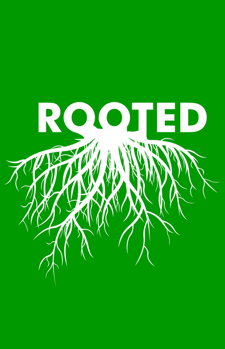
 Rooted is a sermon series title for a church in south Texas. This graphic is here because it embodies a simplistic design, offers an interesting visual display and brings up a conversation about the line between a graphic piece and a logo. This design first off, is a graphic not a logo. It can serve as a logo (especially in this day) but it doesn’t work well as a logo because of it’s complexity and it’s lack of being easily recognizable. From a distance this image would look like the word “ROOTED” with a blurry blob underneath – not an effective design for branding. However as a graphic this piece works very well because of it’s dynamic rhythm found in the roots and easy to read title. It’s almost always fun to have a dynamic background with something as simple as a 2 color fade but in this scenario it works better with a single monochromatic tone (a color choice that was very carefully selected).
This little beauty was picked up from http://www.inspiredology.com. It is an excellent example of good typography and is a fun display of what graphic design is about.


